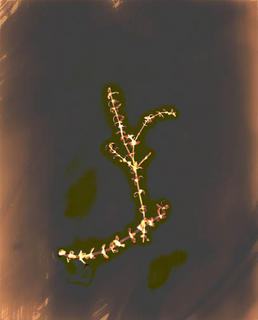
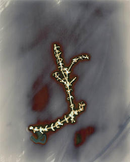
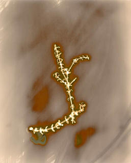
I played around with the curves on this one
 On this one I just applied auto color
 This one is the original scan, which doesn't at all match the original print (I've finally decided I'm going to have to rescan this to get it to match the original print)
 After playing around like this, I think this could be a way to take Burchfield's idea one more step. But I almost feel like it's a cheap way to be different. And, there are some that I just can't bring myself to alter so dramatically; the original colors are too beautiful to not try to preserve.

5 comments:
go to www.photoeye.com click on galleries, then click on photoeye santa fe gallery, go to the second page, and click on JAMES HAJICEK CAROL PANARO-SMITH. They are pushing this idea pretty far.
One idea to help with your scanning, use a gray card or one of those new digital targets click here, put the card along the edge of your print and set the gray point in the scanner software off of it instead of just off the print.
(You probably could make your own. Just go into photoshop, and make a new file with gray, black and white.)
Then crop it out once your colors are set
I've never tried it but it seems like it should work.
Thanks for the tips guys. I was getting really frustrated with trying to fix some of these scans. Part of it is a little bit of inexperience with working with color images in photoshop, but most of it is from just really poor scans.
also, thanks for the web link Darren. It's been a while since I've been to PhotoEye. It kind of slipped my mind
Post a Comment